Wednesday 12 February 2014

Title

For our opening title sequence, we've decided our title will be placed near the beginning of our OTS, after our production company being shown, a link to our storyboards is here

We will be using iMovie to create our title. I have been researching different film noir titles, as shown here:

All titles are in black and white with either bold or script writing, most in capitals. We'll use all these examples to help us decide a title font.
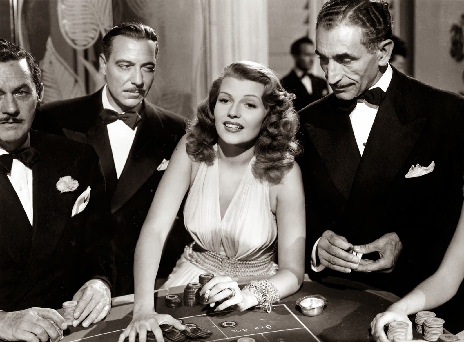

"The Third Man"

"The Third Man"'s opening title sequence is on artofthetitle.com : http://www.artofthetitle.com/title/the-third-man/

Our OTS will include this:

However in the Third Man, the OTS includes pretty much everyone included in making the film, and our OTS will not as this is outdated.

 I used www.dafont.com to create the title of the film. On the website you can download free fonts onto your computer and use them. To choose the font, I used the first picture in this post, of my Google search of film noir titles. I also took into account our OTS would be neo noir, and so below, chose a few more modern looking fonts.


 This font is similar to the Third Man's font as it is serif. On my Google search this font is much like the title of "Gilda". However, as it's a narrow font, it could look too small.
 This font is similar to "They Live By Night" from my first picture of my Google search. I like the asymmetry shown by the thin side and thicker side of each letter.


This font is similar to the font above because of the asymmetry, but as it is sans serif it look modern compared to the two fonts above, this is good for our neo noir OTS.


Final title.

I made the final title from downloading the font from www.dafont.com and using paint on the school computers. I edited a motion blur to represent the transition I told Cal to use for the OTS, of a fade out.

Cal edited our final opening title sequence and so, changed the font to what he thought would look good not the group, and didn't consult us. Also, Cal didn't edit the distribution company's (studio canal) logo into our OTS. As Cal is the editor, Elliott and I couldn't change the title and distribution company's font, and so it looked like this:


Monday 10 February 2014

Costume and Make up Planning

Costume:

Our opening title sequence is neo noir, which is a new version of film noir. We chose to have a neo noir genre so we could have our own unique twist on a film noir.


Due to our neo noir genre, our costume is not typical of film noir, which is typically like the picture on the left, (eg. feminine glamorous dresses, men in suits). Alternatively, all three characters (me, Cal, and Elliott) will all be wearing suits. This is similar to the film noir typical conventions. We decided to do this as in our storyline, we meet in a rundown side street casino (due to our age, we couldn't have a real casino), as I am part of the game, we decided to all wear suits, instead of the female wearing a dress.


Make up:


These are the things we used to create my fake wound and blood. Cal used the special effects wax and red colouring for my wound, while the jam was mixed with food colouring to make the would look wet, like real blood, that Elliott made. Also, Cal had the Jam on his hand. Ms Humpleby gave us the idea of using cheap red jam, as it's consistency looks on camera exactly like blood.

Before Cal put it on my face, Elliott attempted on his own hand, as shown to the left.
In this picture, we used the wax, colouring, and jam, as we did on the final recording.


Before using the special effects wax, I researched online for ways to create a fake wound with make up. Here are the links: bullet woundbullet wound. Although we used wax for the real thing, ideas from these links helped create the final look.

The pictures below are pictures of my fake fake wound. The first picture is just the wax, Cal put into a circle, as recommended on the above links, with an indent. The second picture is with the white, red, and some colouring over the wax. The outcome is it does look like a bullet wound, but more like a scab. At which point we put the jam and food colouring mixture slightly in the indented part of the bullet wound, to make it look like a fresh, bleeding wound.


And here is the final look, just before recording:


Monday 3 February 2014

Production logo - Pulse Productions

Cal created this studio indent.  His post for this is here

I believe this could be improved, as the black gradient makes the Pulse Productions a little hard to see in our second edit. This is a minor issue.