We will be using iMovie to create our title. I have been researching different film noir titles, as shown here:
All titles are in black and white with either bold or script writing, most in capitals. We'll use all these examples to help us decide a title font.
"The Third Man"
"The Third Man"'s opening title sequence is on artofthetitle.com : http://www.artofthetitle.com/title/the-third-man/
Our OTS will include this:
However in the Third Man, the OTS includes pretty much everyone included in making the film, and our OTS will not as this is outdated.
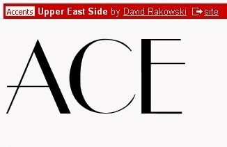
This font is similar to the Third Man's font as it is serif. On my Google search this font is much like the title of "Gilda". However, as it's a narrow font, it could look too small.
This font is similar to "They Live By Night" from my first picture of my Google search. I like the asymmetry shown by the thin side and thicker side of each letter.

This font is similar to the font above because of the asymmetry, but as it is sans serif it look modern compared to the two fonts above, this is good for our neo noir OTS.
Final title.
I made the final title from downloading the font from www.dafont.com and using paint on the school computers. I edited a motion blur to represent the transition I told Cal to use for the OTS, of a fade out.
Cal edited our final opening title sequence and so, changed the font to what he thought would look good not the group, and didn't consult us. Also, Cal didn't edit the distribution company's (studio canal) logo into our OTS. As Cal is the editor, Elliott and I couldn't change the title and distribution company's font, and so it looked like this:


No comments:
Post a Comment